Italian Energy
A brief exploration of the Energy landscape in Italy
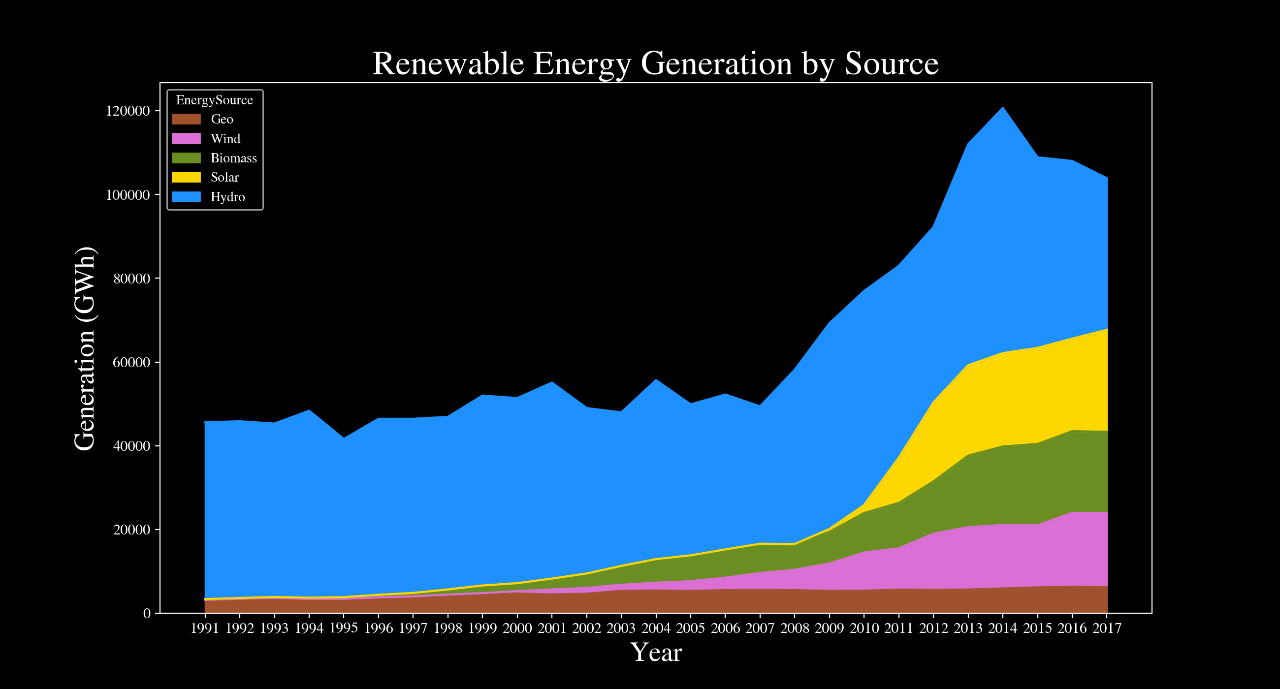
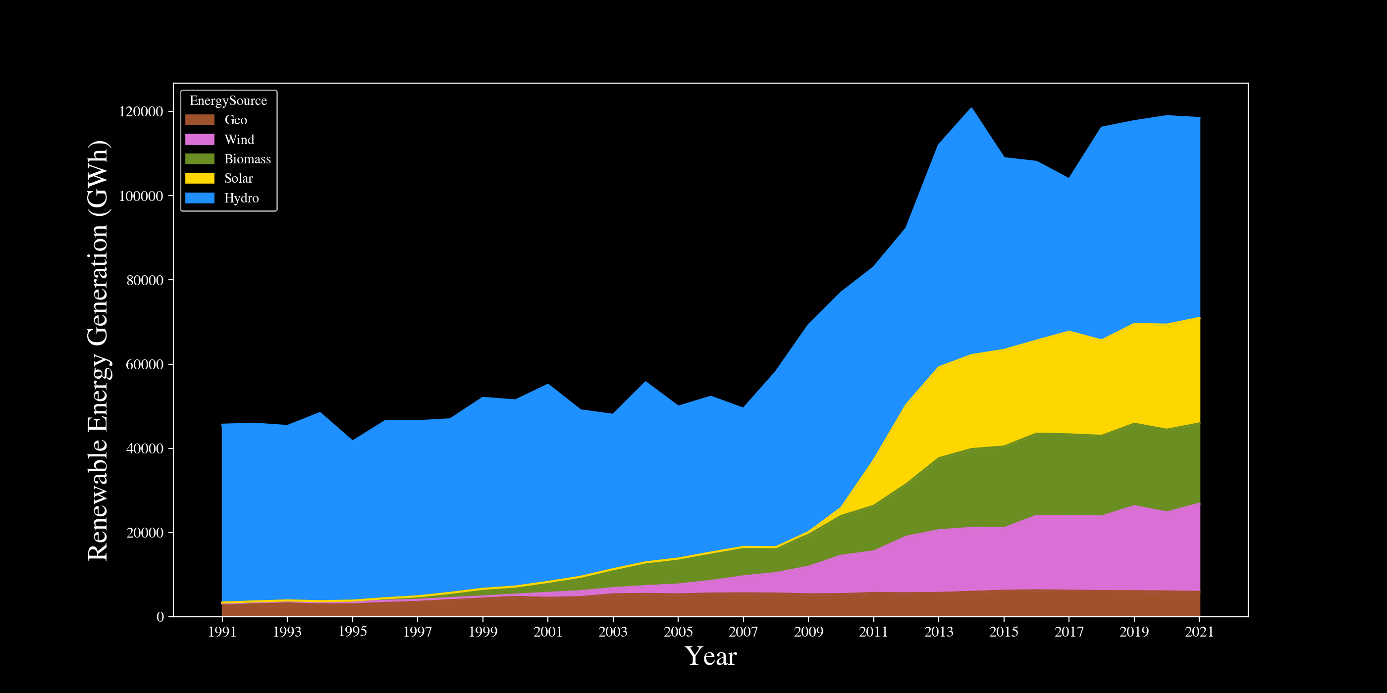
Renewable Energy Generation 1991-2017 by Source (ISTAT)
My first thought was to look for energy generation data on the Italian National Institute of Statistics (ISTAT) website. While I was midly disappointed to find data only up to 2017 I was happy that it stretched all the way back to 1991. The plot below is a stacked plot chart of the energy generation (in GWh) for this time period divided by five popular energy sources. These kind of charts are great for visualizing the relative impact of each source on the total generation, but make it hard to get a grasp for the absolute generation of each source. Nonetheless, we can see that solar has a steep ramp up around 2010, whereas wind and biomass were more incremental, starting to increase at the start of the millennium. On the other hand, hydroelectric energy generation seems more consistent throughout years. Geothermal seems constant but by inspecting the numbers one can see that it has actually roughly doubled since 1991. Code for the plot.
After some searching, I reckon that the steep increase in solar energy generation was mostly driven by Italy’s National Renewable Energy Plan. According to Wikipedia, Italy had several incentive schemes to boost PV production and anecdotally, I do remember quite a few friends having solar panels installed around that time and even my parents considered it.
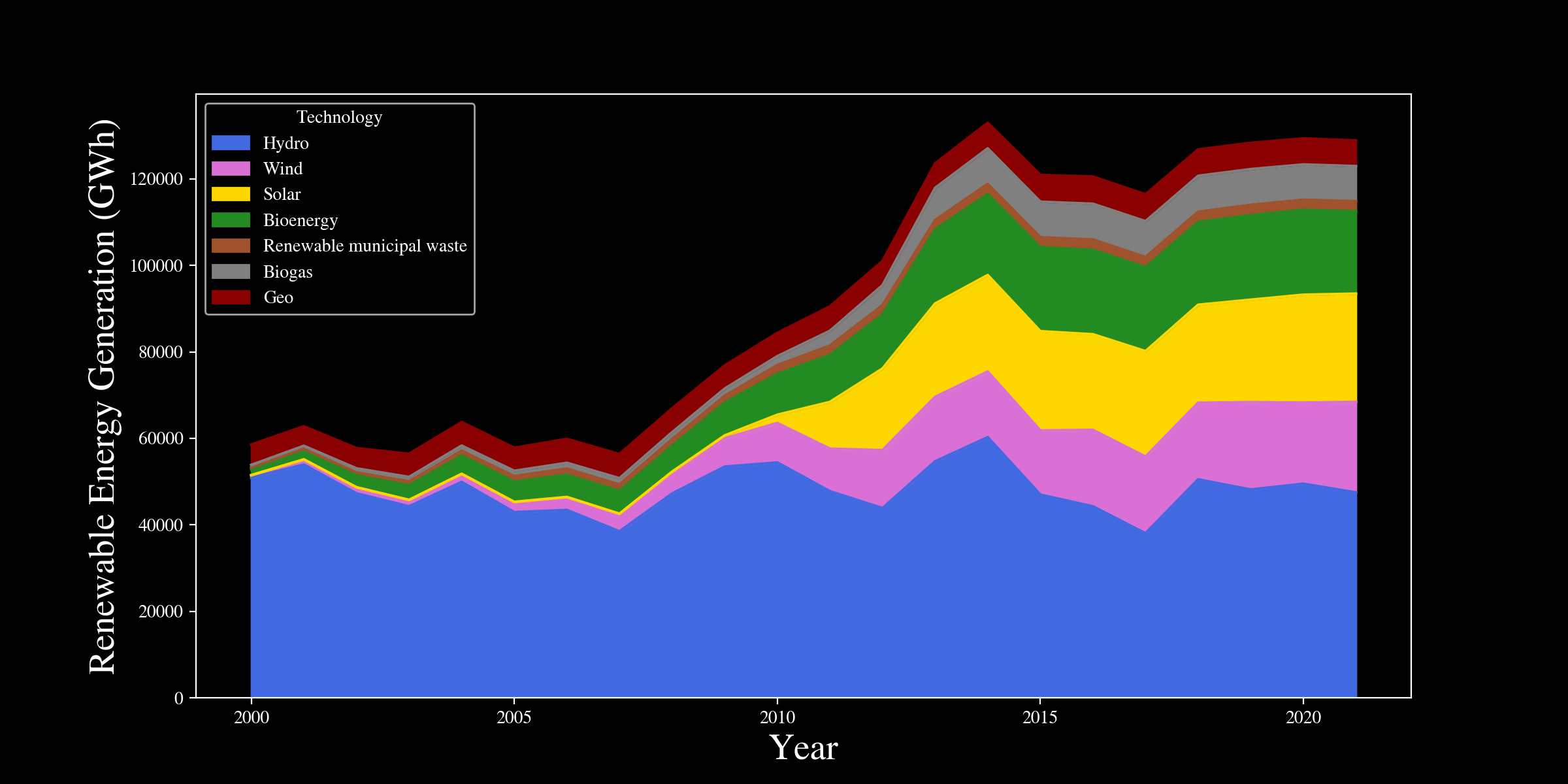
Renewable Energy Generation 2000-2021 by Source IRENA
Later on, I found out that the International Renewable Energy Agency (IRENA) has some data about the Renewable Energy Generation of Italy on their website. One nice thing about this data is that is also contains energy generated by municipial waste and it separates bioenergy and biogas. This chart seems to be in line with the data from ISTAT as we can see that hydroelectric energy stay relatively constat, whereas solar starts increasing around 2010. Code for the plot.
Combined Renewable Energy Generation
I decided to attempt to combine these two datasets. In this notebook I have checked whether it made sense to combine these datasets. The data for Wind, Solar, and Geo matches perfectly whereas the one for Hydro seems to be slightly different but follows the same overall trend. The resulting combined data is shown below.
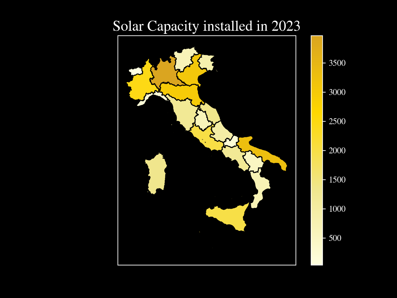
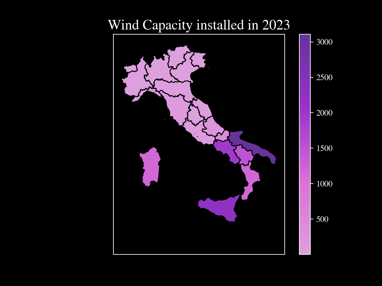
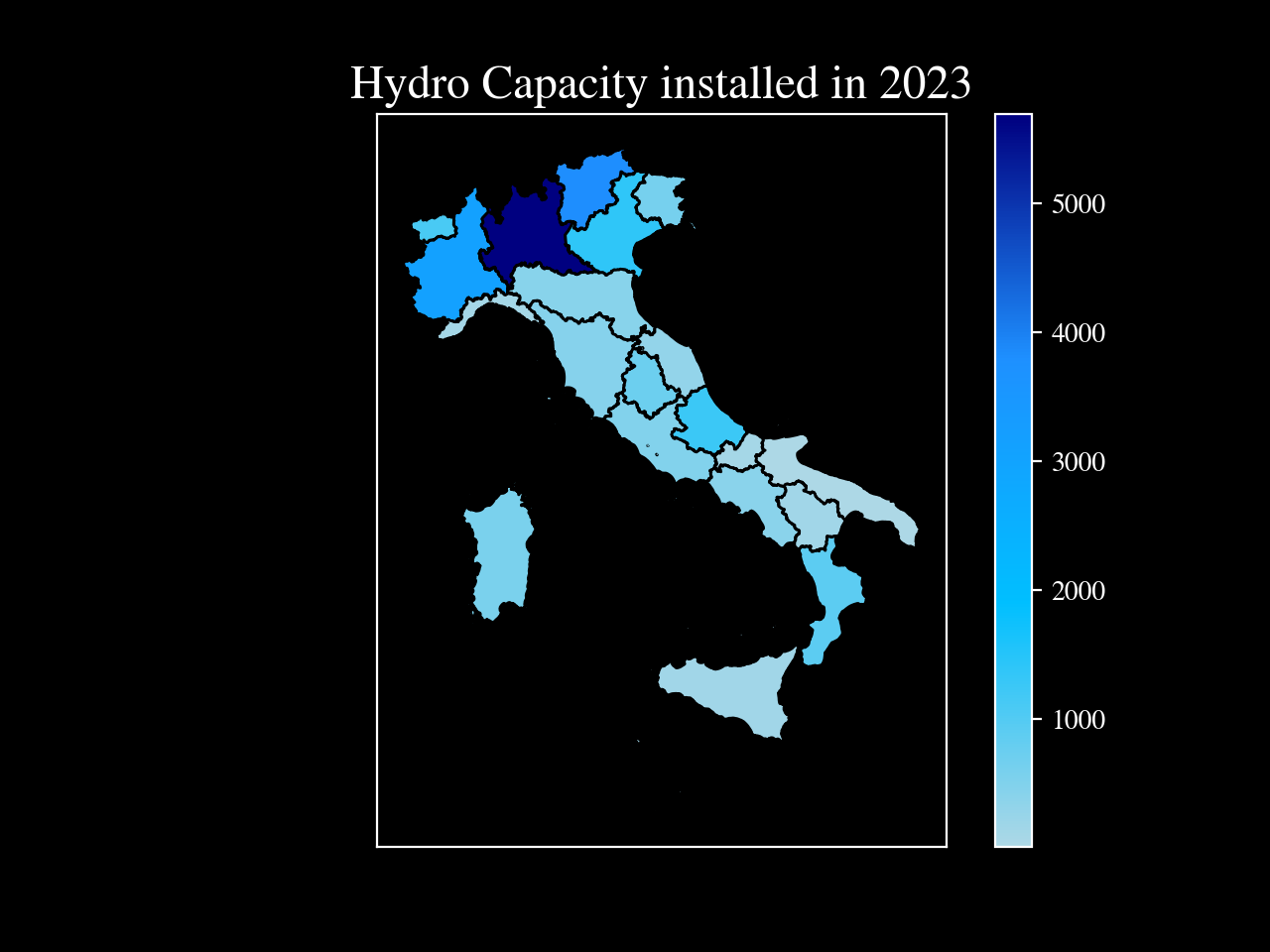
Renewable Capacity by Italian Region in 2023
The only data I could find that was divided by region was the one provide by Statista, which in turn took it from Terna, the biggest transmission operator system in Italy. I tried to get access to their GAUDI system and apply for data usage but I haven’t heard back yet, so I simply decided to download the Statista data. Of course, this is clean and simple data, which makes it less of a challenge, yet I had fun playing around with GeoPandas and making the following three plots. Data was downloaded from here, here and here respectively.
The following three plots show the capacity that was installed in different italian regions in 2023. It was interesting for me to see how most of our wind capacity was installed in the south. My guess is that Italy is quite narrow, so at the south the effect of the sea is very strong and can lead to strong currents. I was suprised to see that a lot of solar capacity was installed in the north. My guess is that this is because people in the nord have access to more capital and especially with the EU recovery fund it might be that people in the north have taken more advantage of the energy renovation discounts provided by the government, since these require a larger initial capital. I will do some more investigation in the coming days. Code for the plots is here.